


Problem:
Build, a cutting-edge data analytics firm, faced a challenge in establishing a strong and distinctive visual identity. The existing brand lacked cohesion and failed to convey the company's innovative approach to data analysis. The need for a visually appealing and memorable brand identity became imperative to communicate their expertise and reliability in the competitive data analytics industry.
Build, a cutting-edge data analytics firm, faced a challenge in establishing a strong and distinctive visual identity. The existing brand lacked cohesion and failed to convey the company's innovative approach to data analysis. The need for a visually appealing and memorable brand identity became imperative to communicate their expertise and reliability in the competitive data analytics industry.
Task:
The task was to create a a strong and distinctive visual identity that conveyed Build’s expertise in data analysis, leveraging a minimalistic and abstract design approach. The goal was to communicate professionalism, reliability, and cutting-edge technology while differentiating the brand in a competitive market.
Services
Brand Strategy
Logo & Identity System
Brand Guidelines
Iconography
Solution
To overcome Build Data Analytics' branding challenges, a strategic approach was adopted, involving a design process that integrated key elements to redefine the brand's visual identity.
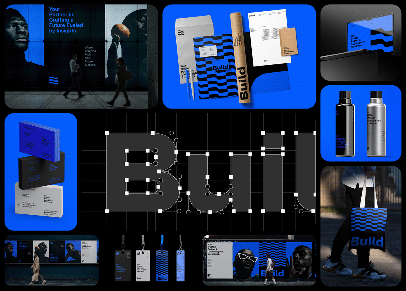
1. Abstract Logo Design: The foundation of the solution was the creation of a distinctive abstract wavy logo symbol. This symbol encapsulated the dynamic essence of data analytics, representing the continuous flow of insights. The design resonated with Build's forward-thinking approach, visually communicating the company's commitment to innovation.
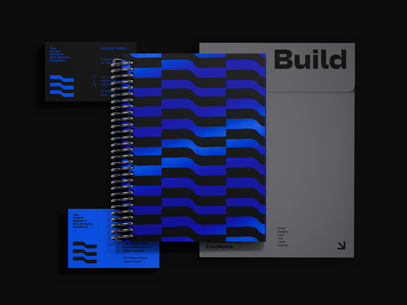
2) Established a Unified Visual Identity: A comprehensive visual identity was crafted, unifying all brand elements. This included the incorporation of the abstract wavy mark across various touchpoints, consistent iconography that reinforced the brand's messaging, a curated color palette of blue, black, and grey to evoke trust and sophistication, and a sans-serif typography for clear communication. This unity ensured brand recognition reinforcing Build's position in a competitive market.
3) Application Across Various Touchpoints: The newly developed brand design was integrated across diverse touchpoints, including stationery, digital platforms, marketing collateral, and outdoor advertising materials. By applying the brand design consistently across these mediums, I created a strong and memorable brand presence that resonated with Build's target audience.
Throughout the process, I worked closely with the Build's team. I shared ideas, listened to feedback, and fine-tuned the designs until they perfectly captured the essence of the brand. This collaborative effort ensured that Build emerged with a strong visual identity, ready to make waves in the world of data analytics.


Identity System Elements
Our brand identity system is composed of an expansive toolkit, whose components are designed to work harmoniously together to meet our wide range of communication needs.
Our brand identity system is composed of an expansive toolkit, whose components are designed to work harmoniously together to meet our wide range of communication needs.

Logo Design:
The creation of an abstract wavy mark served as the cornerstone of the brand identity. The dynamic and fluid nature of the mark symbolized the continuous flow of data and insights that Build Data Analytics offers to its clients. This distinctive visual element conveyed a sense of innovation, adaptability, and forward-thinking, setting the brand apart in a competitive market.
The creation of an abstract wavy mark served as the cornerstone of the brand identity. The dynamic and fluid nature of the mark symbolized the continuous flow of data and insights that Build Data Analytics offers to its clients. This distinctive visual element conveyed a sense of innovation, adaptability, and forward-thinking, setting the brand apart in a competitive market.


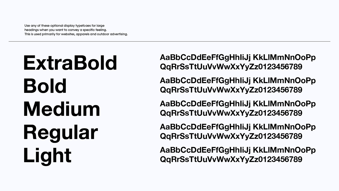
Typography Exploration
Explored various typefaces to find the right balance between modernity and professionalism. After careful consideration, a clean and modern sans-serif typography was chosen for its simplicity and readability.
Explored various typefaces to find the right balance between modernity and professionalism. After careful consideration, a clean and modern sans-serif typography was chosen for its simplicity and readability.

Typography
A sans-serif font was adopted for its clean, modern aesthetic and readability. The typography enhanced brand consistency across various platforms and ensured that key messages were communicated clearly and effectively.


Color Palette:
Chose a minimalist color palette consisting of black, blue, and grey. Black symbolized sophistication and depth, blue conveyed trust, reliability, and technology, and grey added a neutral, balanced tone.
Chose a minimalist color palette consisting of black, blue, and grey. Black symbolized sophistication and depth, blue conveyed trust, reliability, and technology, and grey added a neutral, balanced tone.


Icon Design
Developed a set of icons that complemented the brand's identity, representing key aspects of data analytics such as insights, connectivity, and innovation.
Developed a set of icons that complemented the brand's identity, representing key aspects of data analytics such as insights, connectivity, and innovation.


Brand Guidelines
A comprehensive set of brand guidelines was established to maintain consistency in visual elements, ensuring a unified brand image across all touchpoints.
A comprehensive set of brand guidelines was established to maintain consistency in visual elements, ensuring a unified brand image across all touchpoints.

Stationery Design
Applied the new visual identity to business cards, letterheads, and other stationery, creating a unified and professional brand presence in physical collateral.
Applied the new visual identity to business cards, letterheads, and other stationery, creating a unified and professional brand presence in physical collateral.


Outdoor Advertising
Designed outdoor advertisements using the established visual elements, ensuring that the brand stood out in both physical and digital spaces.
Designed outdoor advertisements using the established visual elements, ensuring that the brand stood out in both physical and digital spaces.


Results:
The new visual identity successfully positioned Build as a forward-thinking and trustworthy player in the data analytics industry. The minimal abstract logo, black, blue, and grey color palette, and the cohesive typography created a strong, modern, and memorable brand presence. The implementation of the brand across various touchpoints, from stationery to outdoor advertising, resulted in increased brand recognition, improved client perception, and a distinct market position for Build within the competitive landscape.

Please share your thoughts in the comments. All feedback highly appreciated!


